Molly, this is kinda hard to read. Your background is pretty textured and that causes a conflict. I'd suggest playing around with different colors and styles of font as well as type of font. [styles being things like bold/underline/italics/embossed/engraved/etc..] Also, what photo editing program do you use? If you have Photoshop Elements or something similar, then you could actually create a 'box' and just make that part of the background be a lower opacity so the picture will still be there, but the text will be easier to work with. Those are just some suggestions; I'd love to help you if you have any questions!
Thank you for your suggestions, Ruth Ann! I though since the background was a little blurry, it might show up 'okay'... but I agree, there is too much texture in it. I'll try playing with the styles some more...
I use Photoshop Elements 5.0. How would you create the box exactly? I can do a lot of the 'basic editing', but I'm not a pro yet! :-) What editing program do you use?
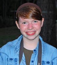
Hi, Molly here...
I'm the older sister in my family.
I have a younger sister and seven brothers.
I use this blog to share what’s going on in our lives.
Thanks for visiting!
 I had a hard time finding a text style that would show up on this... can y'all read it okay?

4 comments:
Molly, this is kinda hard to read. Your background is pretty textured and that causes a conflict. I'd suggest playing around with different colors and styles of font as well as type of font. [styles being things like bold/underline/italics/embossed/engraved/etc..] Also, what photo editing program do you use? If you have Photoshop Elements or something similar, then you could actually create a 'box' and just make that part of the background be a lower opacity so the picture will still be there, but the text will be easier to work with. Those are just some suggestions; I'd love to help you if you have any questions!
Thank you for your suggestions, Ruth Ann!
I though since the background was a little blurry, it might show up 'okay'... but I agree, there is too much texture in it.
I'll try playing with the styles some more...
I use Photoshop Elements 5.0.
How would you create the box exactly? I can do a lot of the 'basic editing', but I'm not a pro yet! :-)
What editing program do you use?
Thanks again!!
Molly, can you give me your email address? It'll be easier to send you an email with explanations and such!
Post a Comment